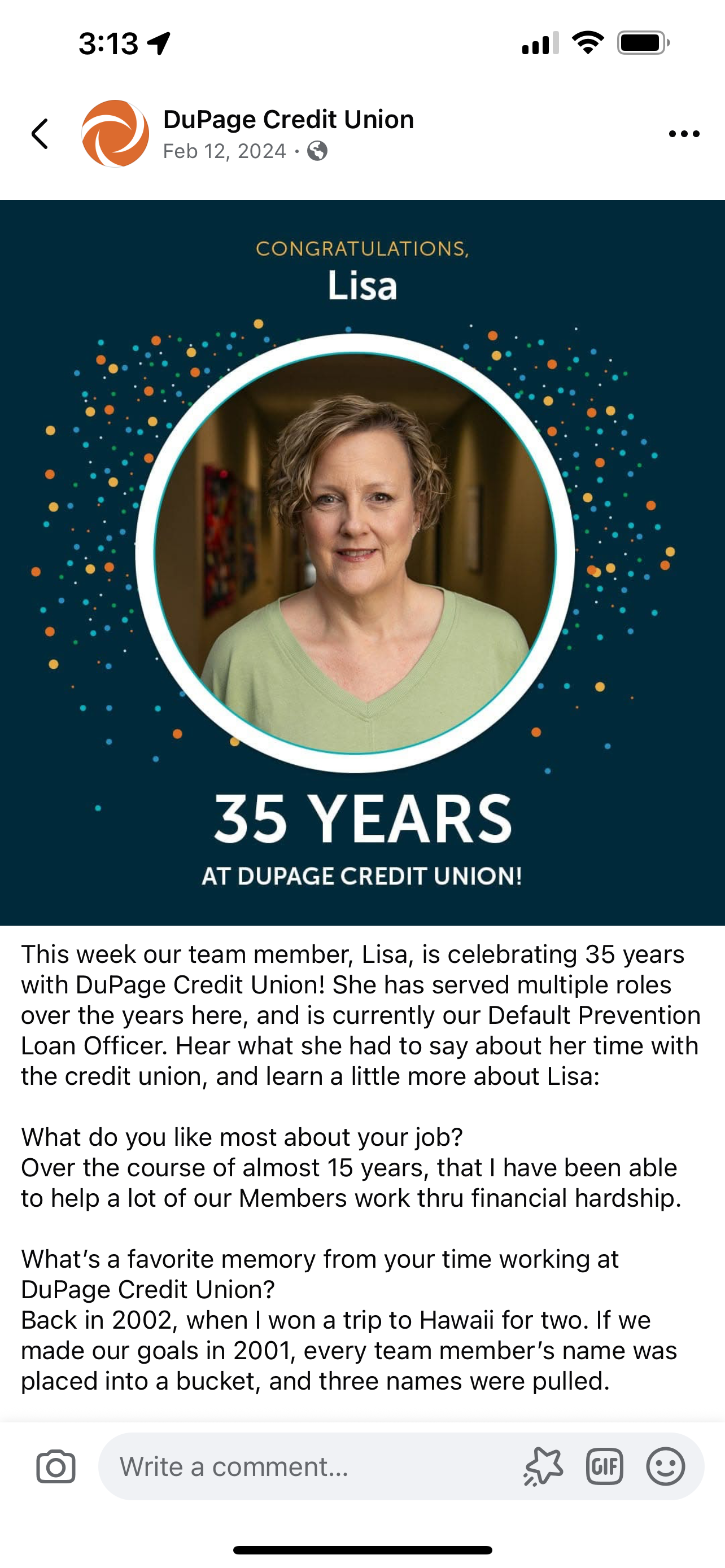
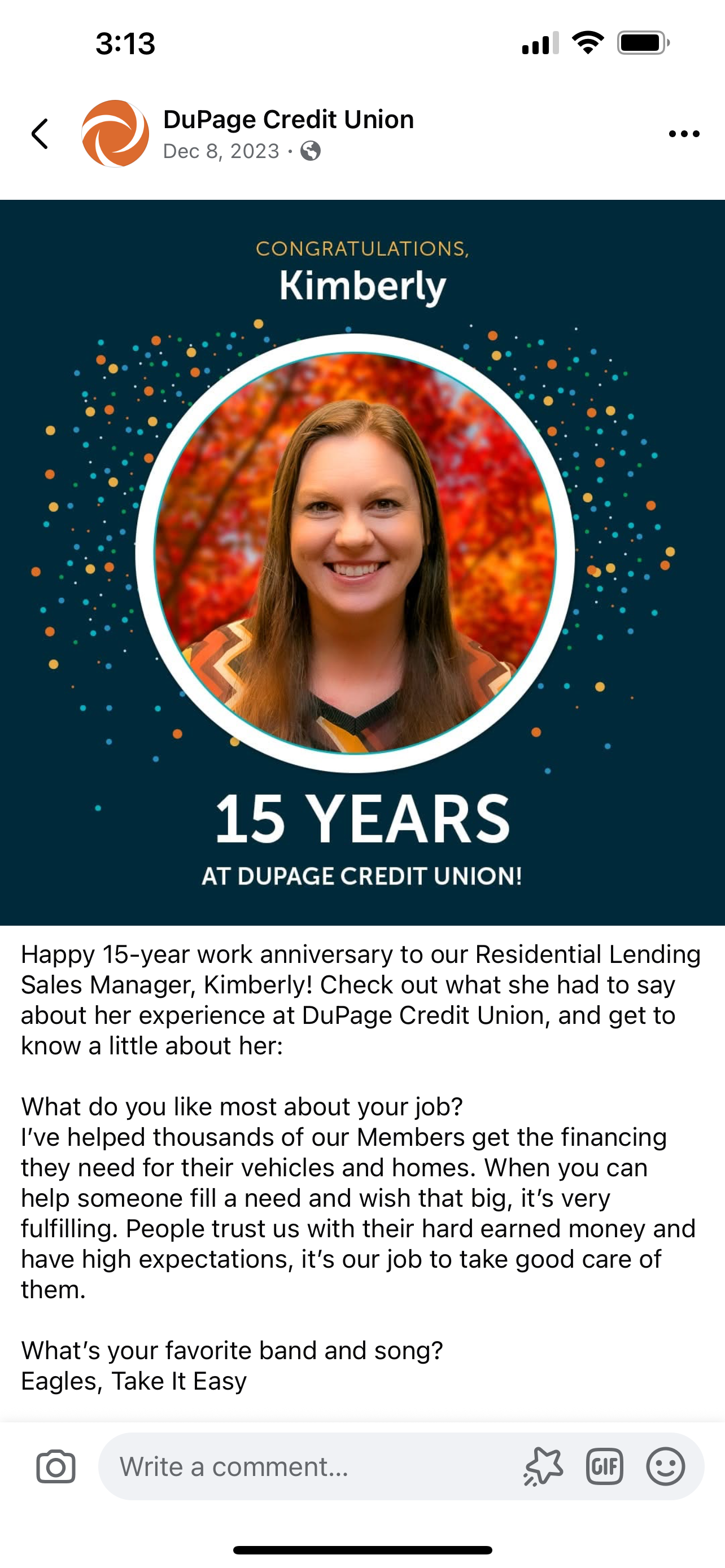
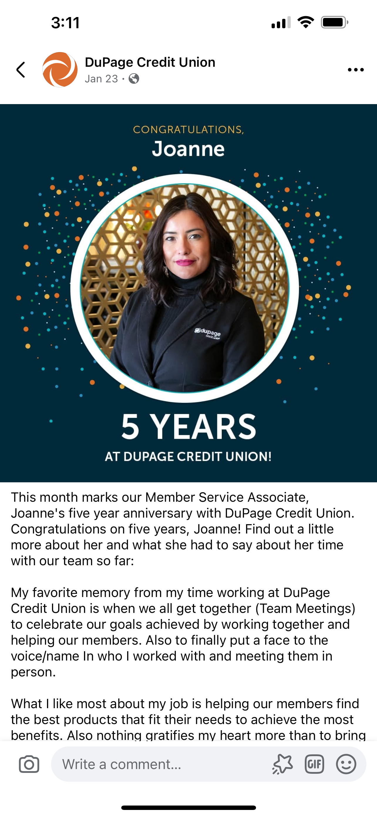
Social media ads for posting on the Credit Union Facebook and LinkedIn pages included employee anniversaries, special offers and general awareness campaign ads. As primary photographer, I made sure each employee anniversary post portrayed our people with professional, high-quality imagery, each portrait looking as unique as the individual portrayed in the social post.
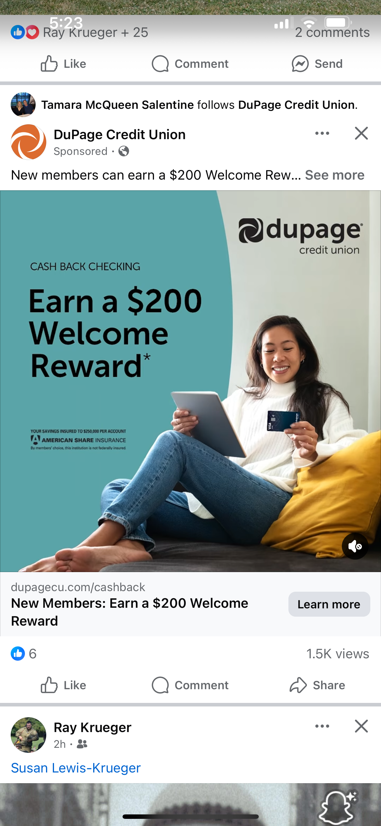
This social media ad on Facebook (below) ended up receiving over 25,000 views in just four weeks, smashing the all-time Credit Union impressions record for Facebook ads. I designed this ad as a video by including some simple motion elements to the headline, which faded the copy in and moved it slightly, line by line. This strategy dramatically increased engagement over previous static ads.
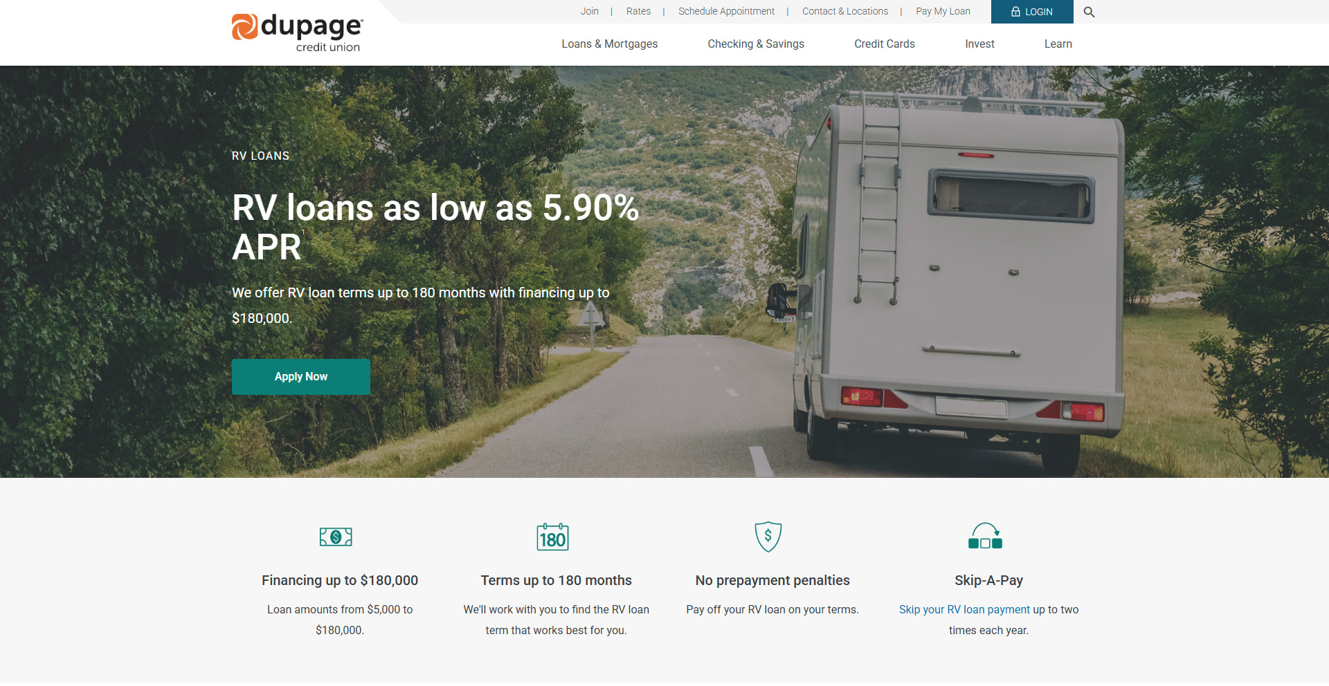
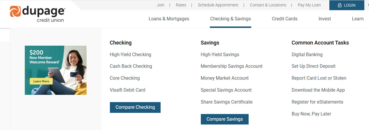
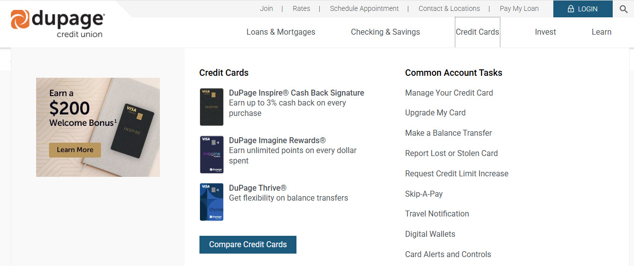
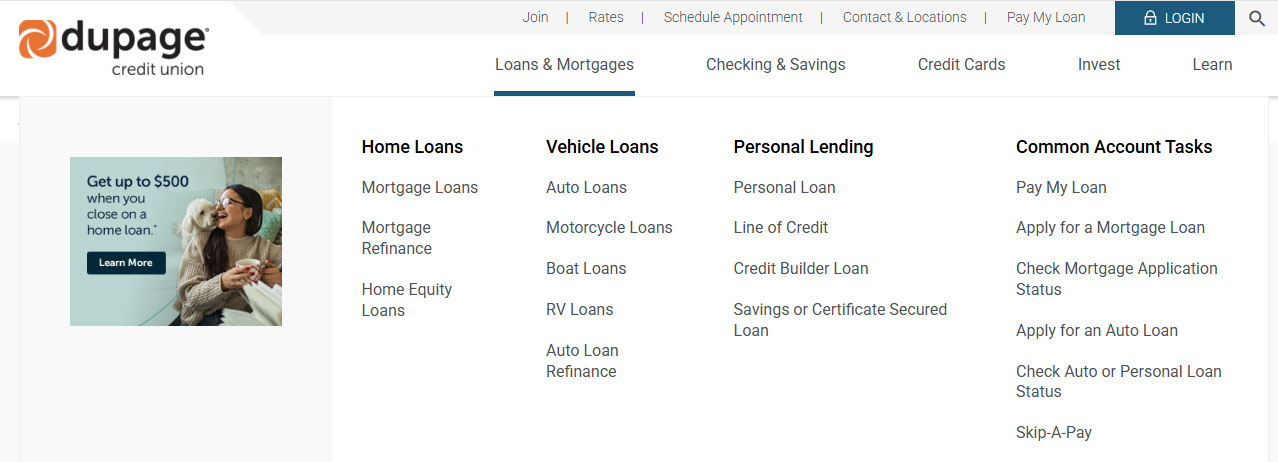
This campaign was replicated on other platforms for maximum exposure. Below is a navigation banner ad I created for the Credit Union web site.
These Featured Offer cards are a prominent fixture of the website's homepage and act as a catalyst to engage members in learning more about timely special offers. When viewed as a whole, these ads must maintain a consistent look and feel and promote brand consistency with regard to typography, color, use of shape elements and layout, yet be different enough from each other to make each offer stand out in its own way.

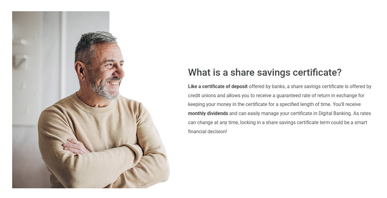
These website ad cards feature more branding elements which help make them feel part of the brand as a whole. I used a round shape element with a cut-out of the woman above to create visual interest and a sense of balance with the copy and call-to-action button to her left. Conversely, I used a more rigid cut-out of the man to bring better balance with the more block-shaped script to his right.
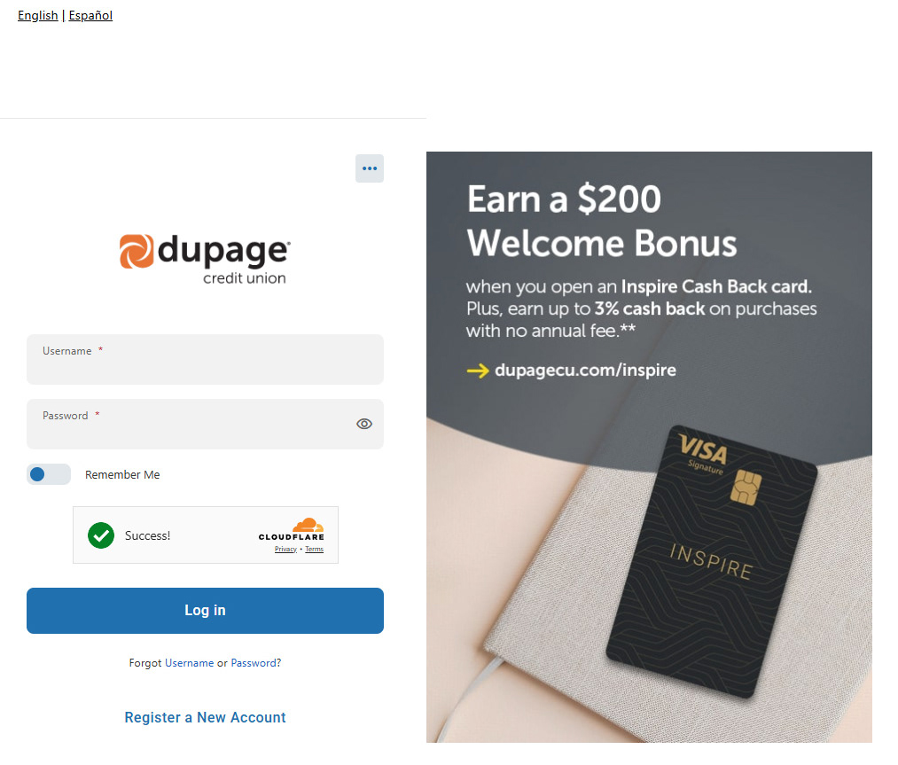
I was also responsible for creating all the in-app ads that appear in the Credit Union's digital banking app. The login screen of the app is the first, as well as one of the greatest, opportunities to promote products and services. I created this welcome bonus offer using a mix of stock and in-house imagery assets along with a brand-identifiable semi-transparent shape element at the top. The typography was carefully crafted to match branding standards and make use of the brand's distinctive arrow, pointing out the URL of the website where members can find more information regarding the bonus offer. While this ad type was not tracked for engagement, it served as a lead element of the overall in-app campaign. Subsequent in-app ads, such as navigation banners or interstitials, made use of this ad's design (color, imagery and layout) to portray a unified look and feel for the campaign.
Navigation banner ad for the same campaign.
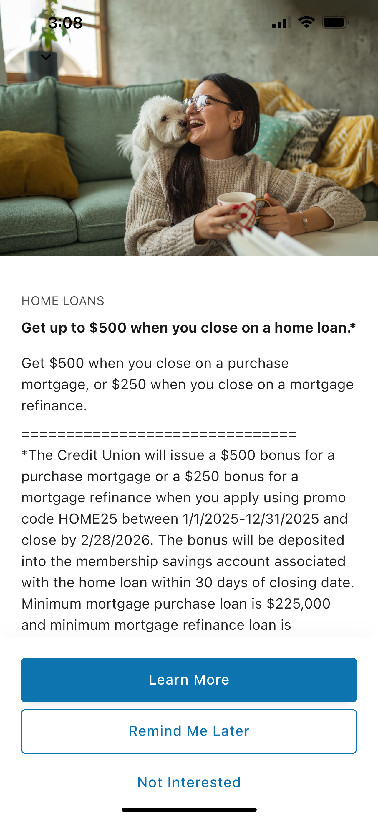
Below is a typical example of one of the many interstitial ads I created for use within the digital banking app. Even in cases where the app architecture forces copy formatting, careful decisions still needed to be made regarding consistency-of-message as well as imagery that is 'on-brand' in terms of subject matter, color and feel.
Navigation banner ad for the same campaign.
I was also responsible for creating and managing a library of icons for the Credit Union website. Below are just a handful of the dozens of original on-brand icons I created for use with the Credit Union website.